Recia Serif Display
Role: typography

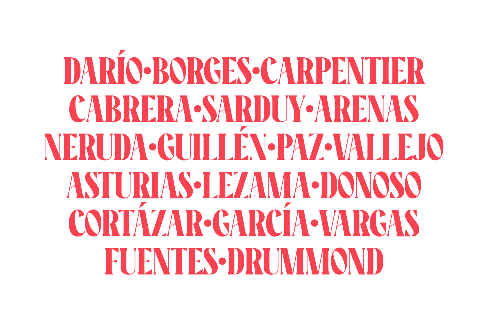
After drawing Recia Display, I wanted to explore the process of building a serif typeface. Here, there wasn’t specific inspiration. I simply decided to take advantage of the same proportions that Recia Display has, but play with a higher stem contrast (mainly with uppercases), rough serifs, and specific angles without losing the form’s density. I think this font would be suitable for packaging and headlines (In fact, sometimes the shapes of this font remind me of old printed newspapers headlines).
I have drawn this font just for fun while I learn the process. If you wanna try it for free you can download it here.