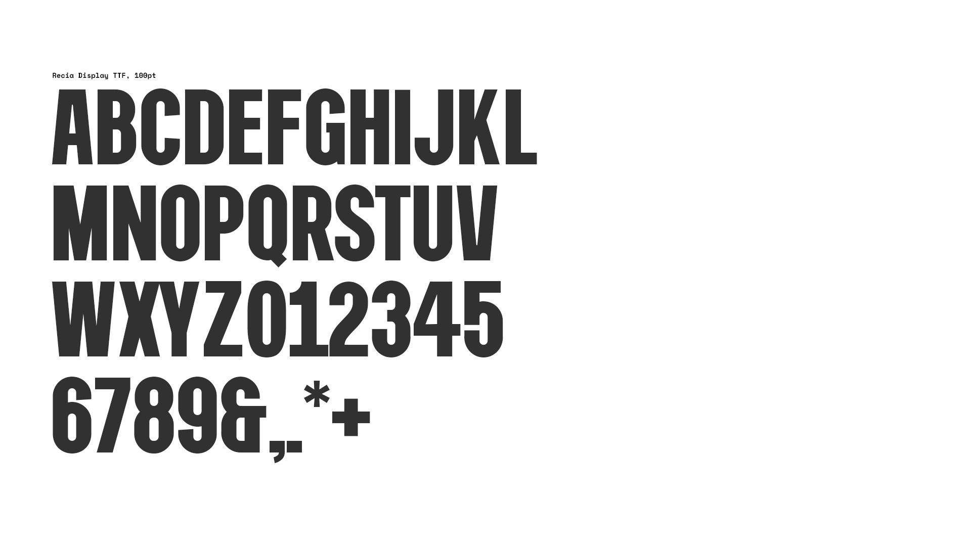
Recia Display
Role: typography
In Madrid, around Plaza Mayor and touristic venues like that, there are still places where people can buy vintage posters of bullfighters and flamenco dancers customized with a name chosen by the customer. I remember myself buying one of those posters the first time I came to Madrid as a tourist and asking them to print on it the name of one of my best friends. They picked some wooden letters out and print her name in a very modest and old-fashioned printing press.
I’ve chosen those basic typefaces as inspiration to draw Recia Display and to take advantage of the process to learn some things about designing fonts and the software you have to know to do it properly. Of course, I’ve realized how demanding and methodical is this process and right now my admiration for typographists has grown even more. How talented and meticulous they are to design beautiful and functional fonts.
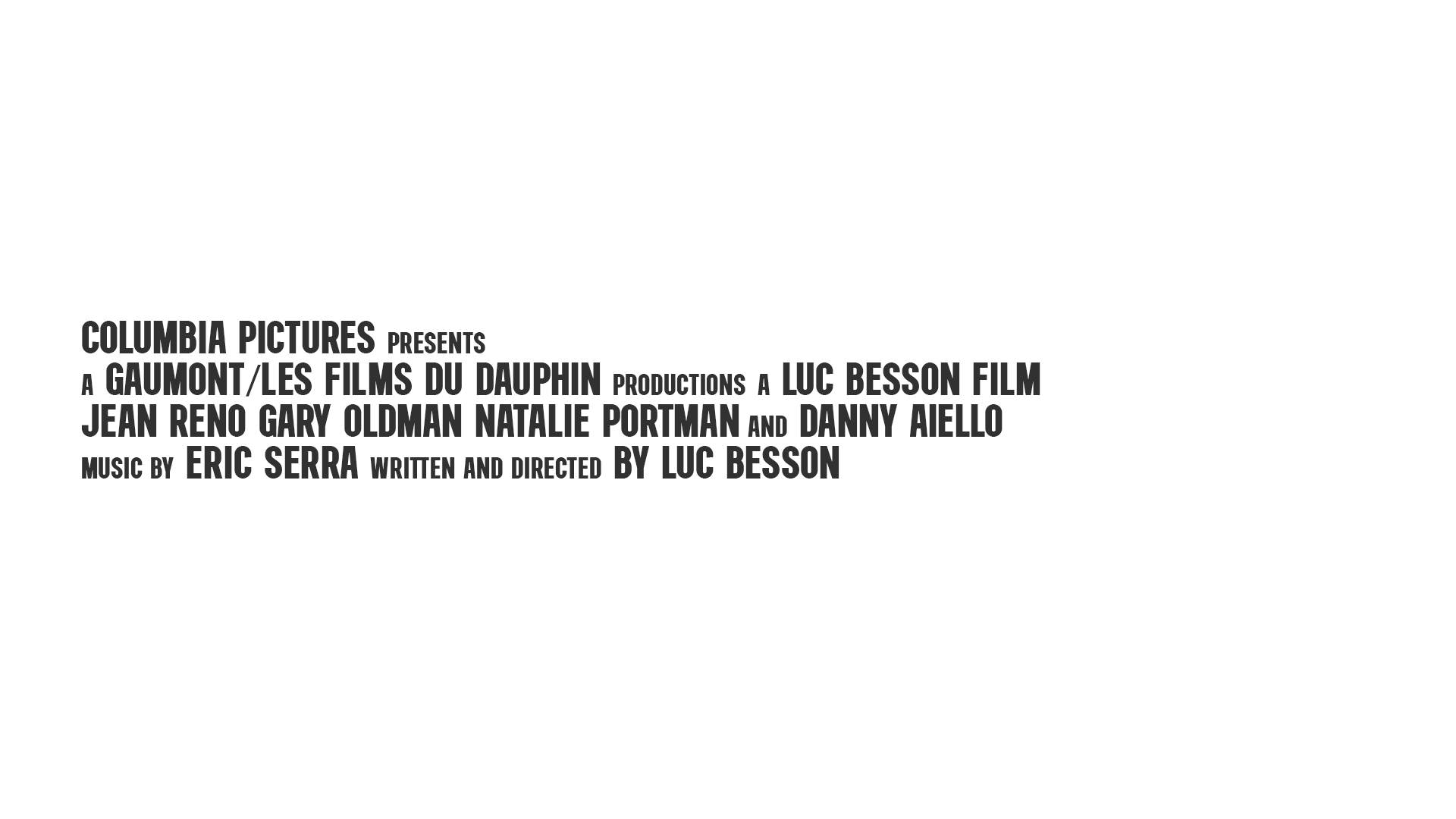
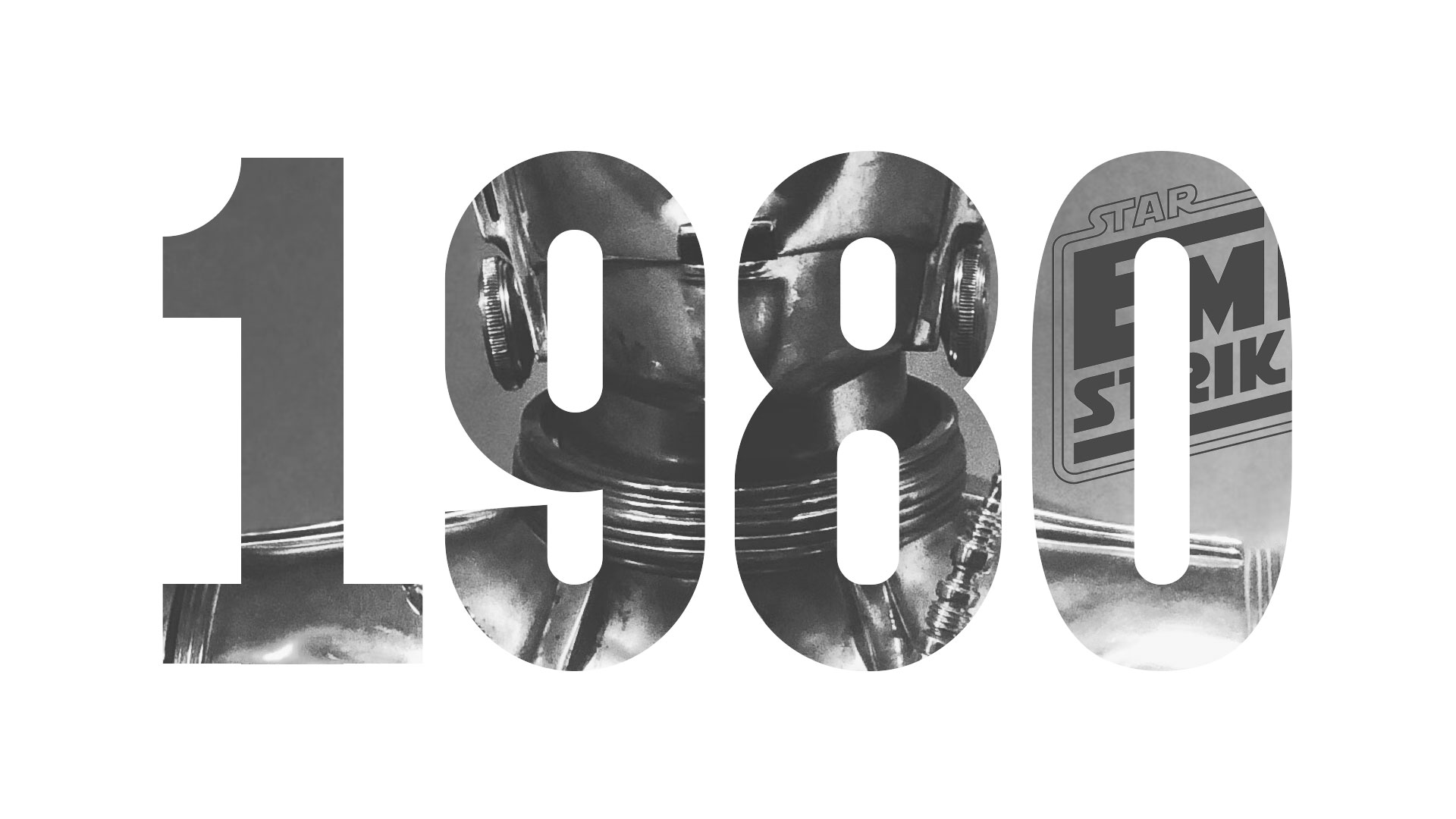
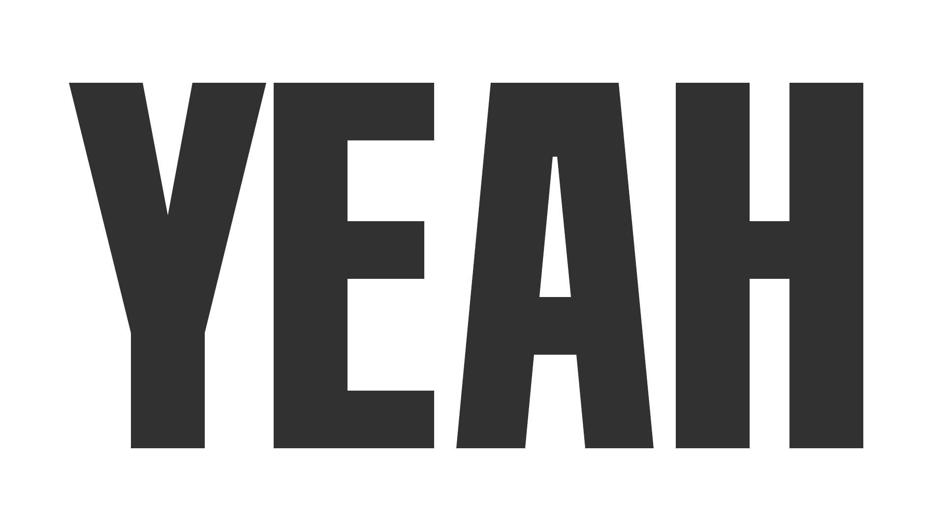
Recia Display is not like that, it’s just a basic display font. However, I’ve learned a lot in the process. I think Recia Display is suitable for headlines and packaging.
If you want to download the beta version (HERE)