

Hotel Kafka
Role: design, concept
Hotel Kafka is an academy specialized in literary studies in Madrid (Spain). They form writers in multiple genres and fields. For more than 15 years, Hotel Kafka has become a meeting point for literature lovers where they can share their passion and opinions in an environment full of freedom and trust.
At the peak of the 2020 global pandemic Hotel Kafka decided to leave its facilities in the historical center of Madrid and set up a full online experience for its students. Even though they have returned to teaching in-person classes, most of their educational structure remains online-based.
The Hotel Kafka brand
Through the years Hotel Kafka has established itself as one of the most recognizable brands and academies in the literary environment of Madrid, but, as time goes by, and its visual identity has started to look slightly messy and outdated.
On the one hand, they are happy with some of brand’s graphic assets (logotype, color) and have no intention of giving them up. On the other hand, they feel that a small reset is needed to better express their values as a center of literary studies: Excellence, creativity, learning, a widely known experience and passion for writing.
In addition, even though well known, Hotel Kafka is a place with a modest budget and a small management team. Their priority is to invest in their teachers in order to guarantee a high quality education which is one of their main goals. They don’t have a marketing, much less a design team, therefore they need a sort of visual system that they can easily apply throughout their communications.
Visual approach
In many ways, this project has been one of a subtle renovation and not a demolition and reconstruction project.
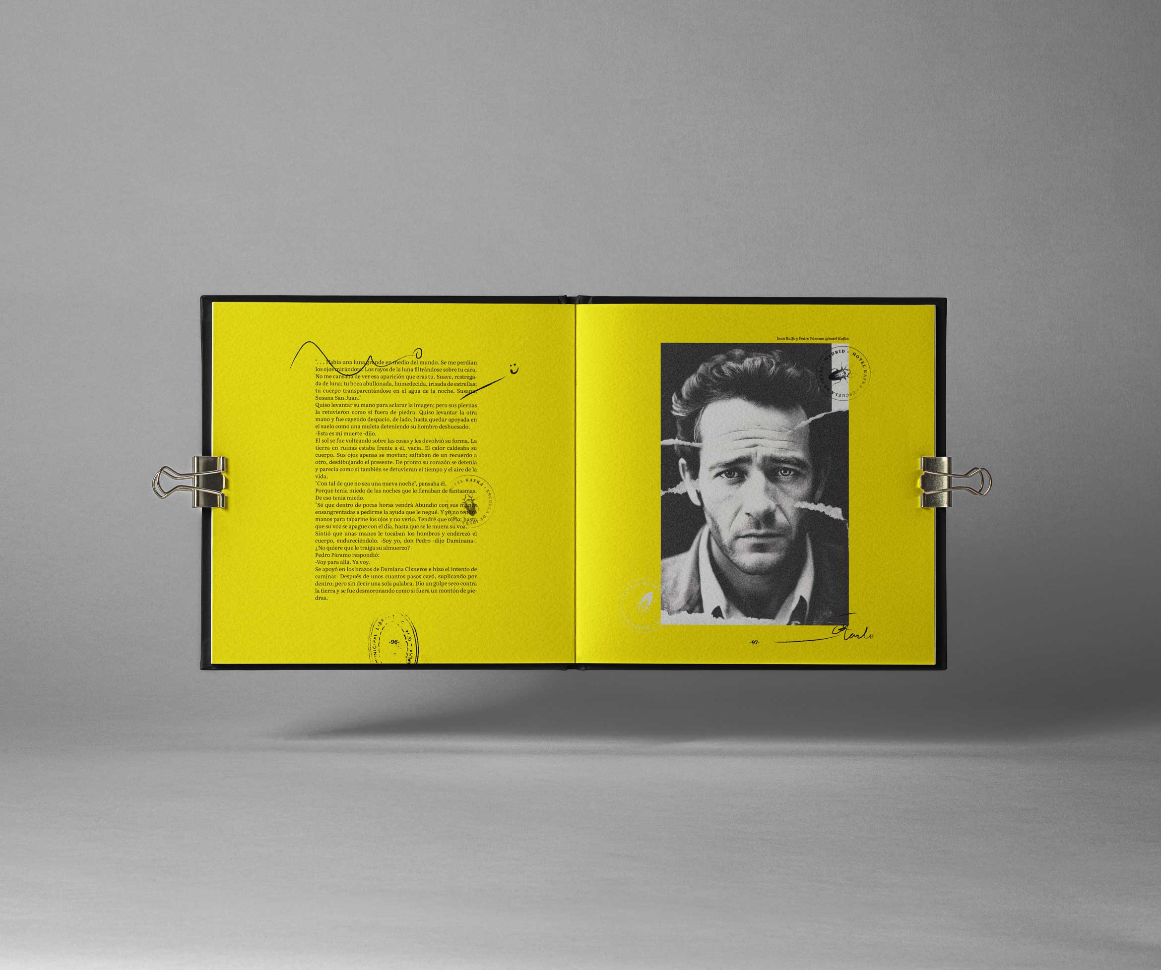
The concept guiding the visual proposal is inspired by the visual aspect of margin notes on books and old galley proofs, which are those printed pages that writers and editors use to mark in pen (proofreader's marks) in order to correct, highlight and comments on the original text before it went to the printers. That is, as a visual analogy of the roll played by Hotel Kafka with its students: through learning they highlight, comment, lead, guide, support, correct, improve, encourage and influence those student’s literary projects.
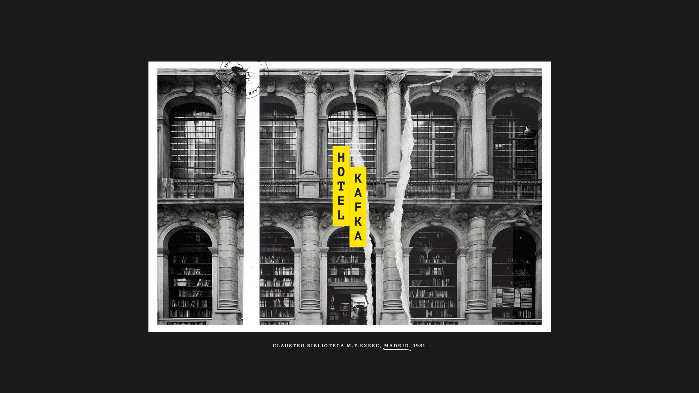
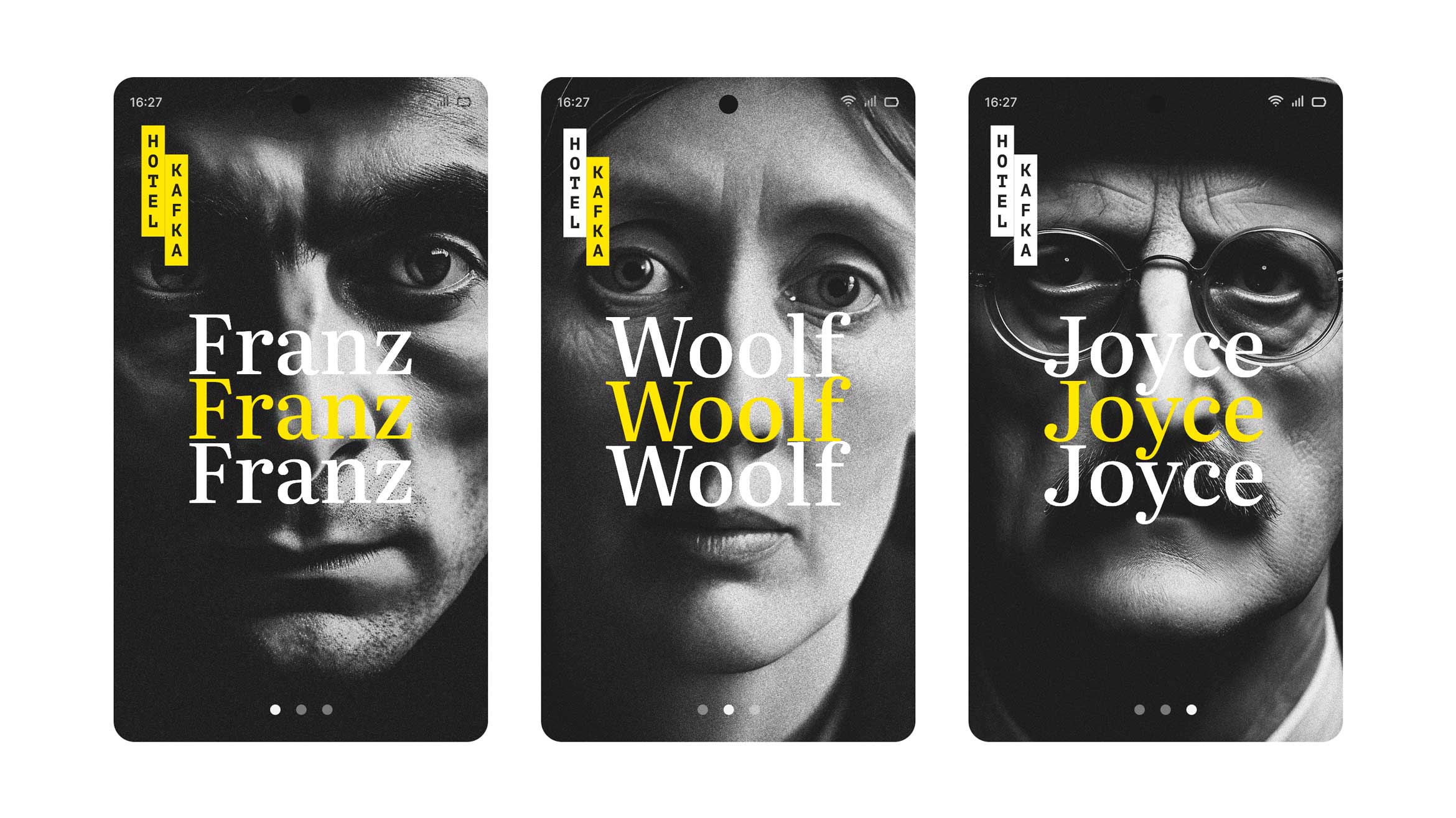
Work has been done on a proposal to redesign Hotel Kafka’s visual environment on online channels, but preserving some of its graphic assets such as its logotype.
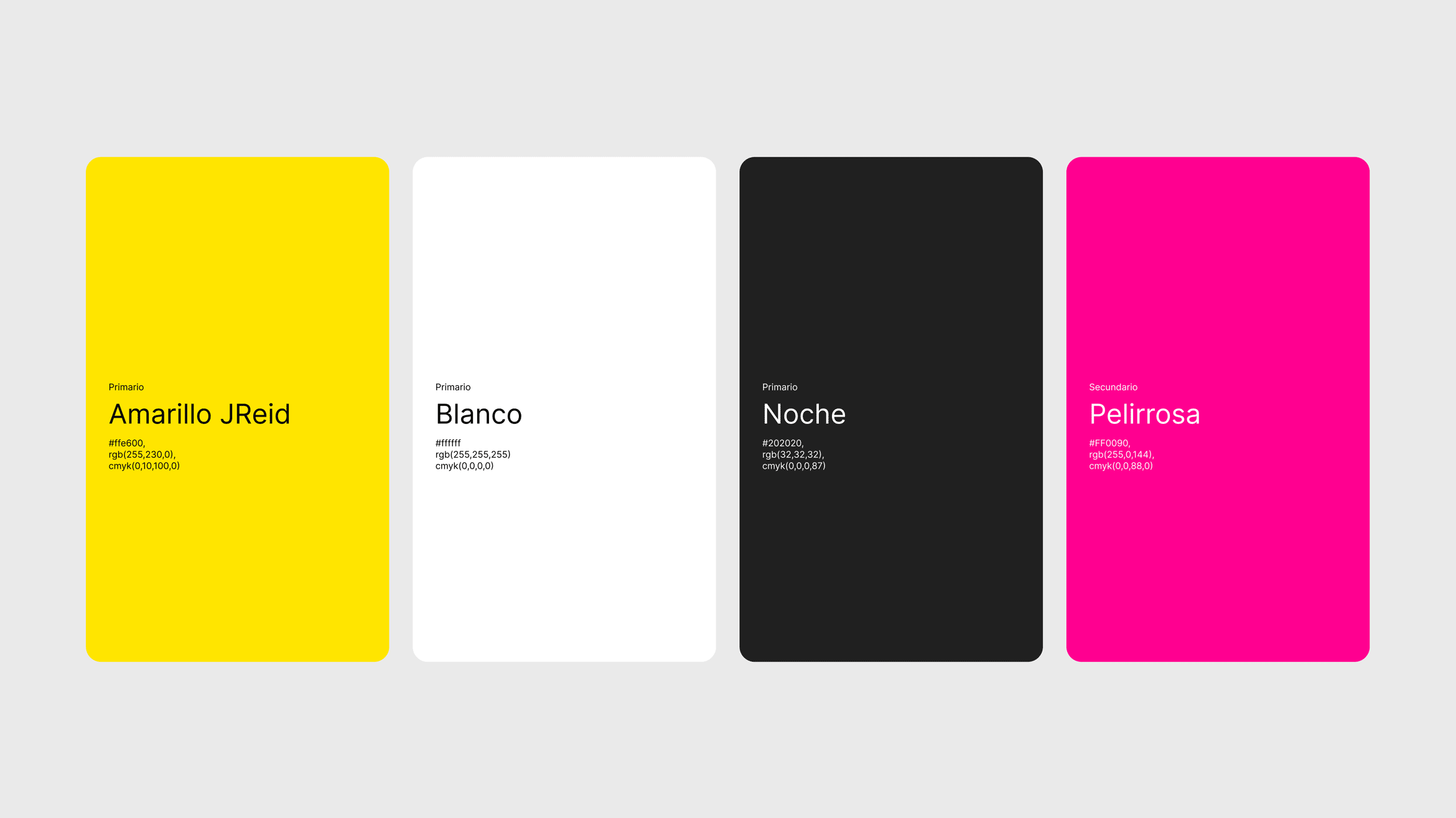
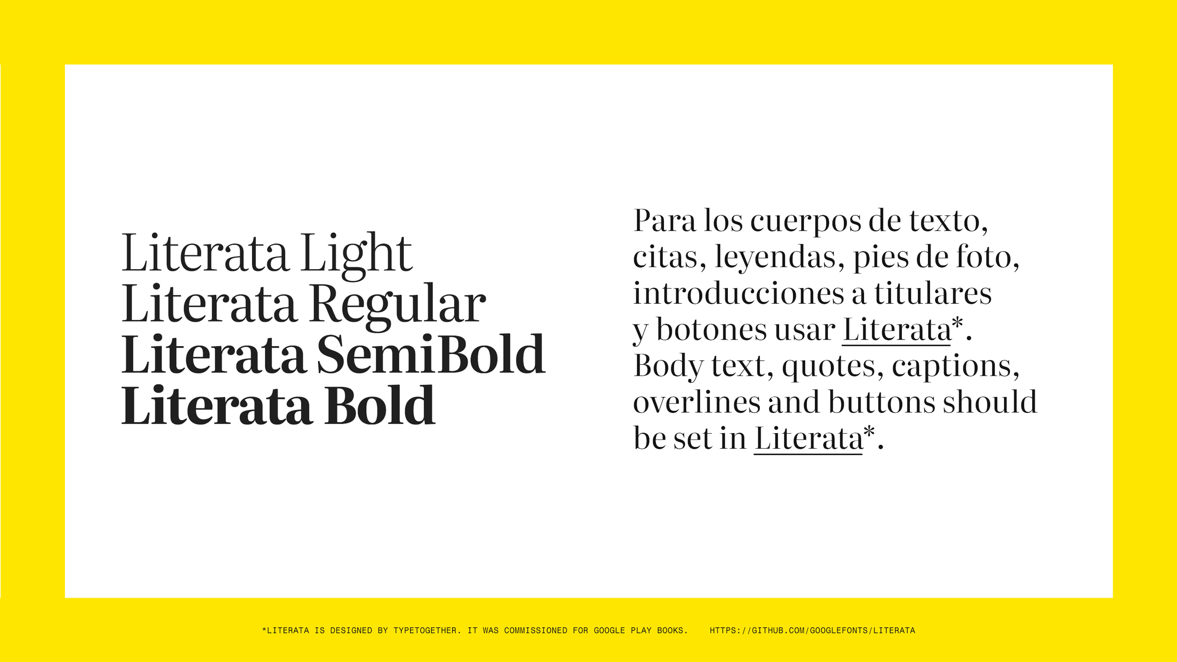
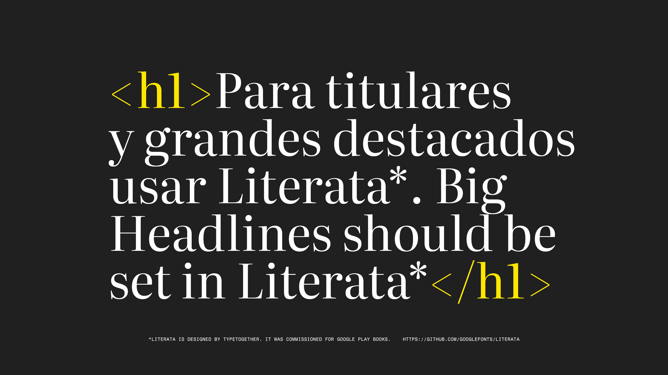
In addition, its color palette has been unified and slightly enriched and a versatile serif typography that embodies a link with classic literature has been selected.
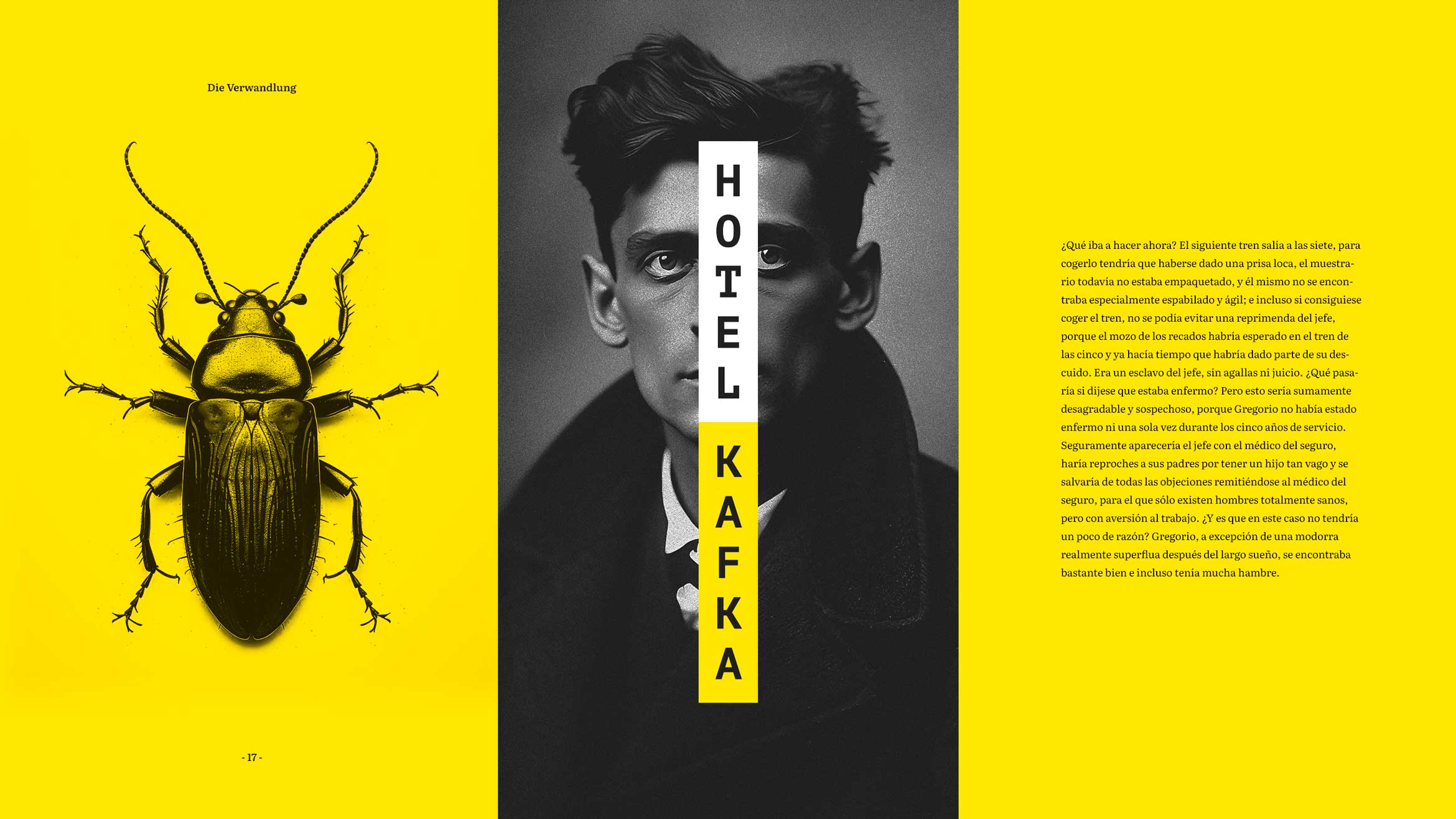
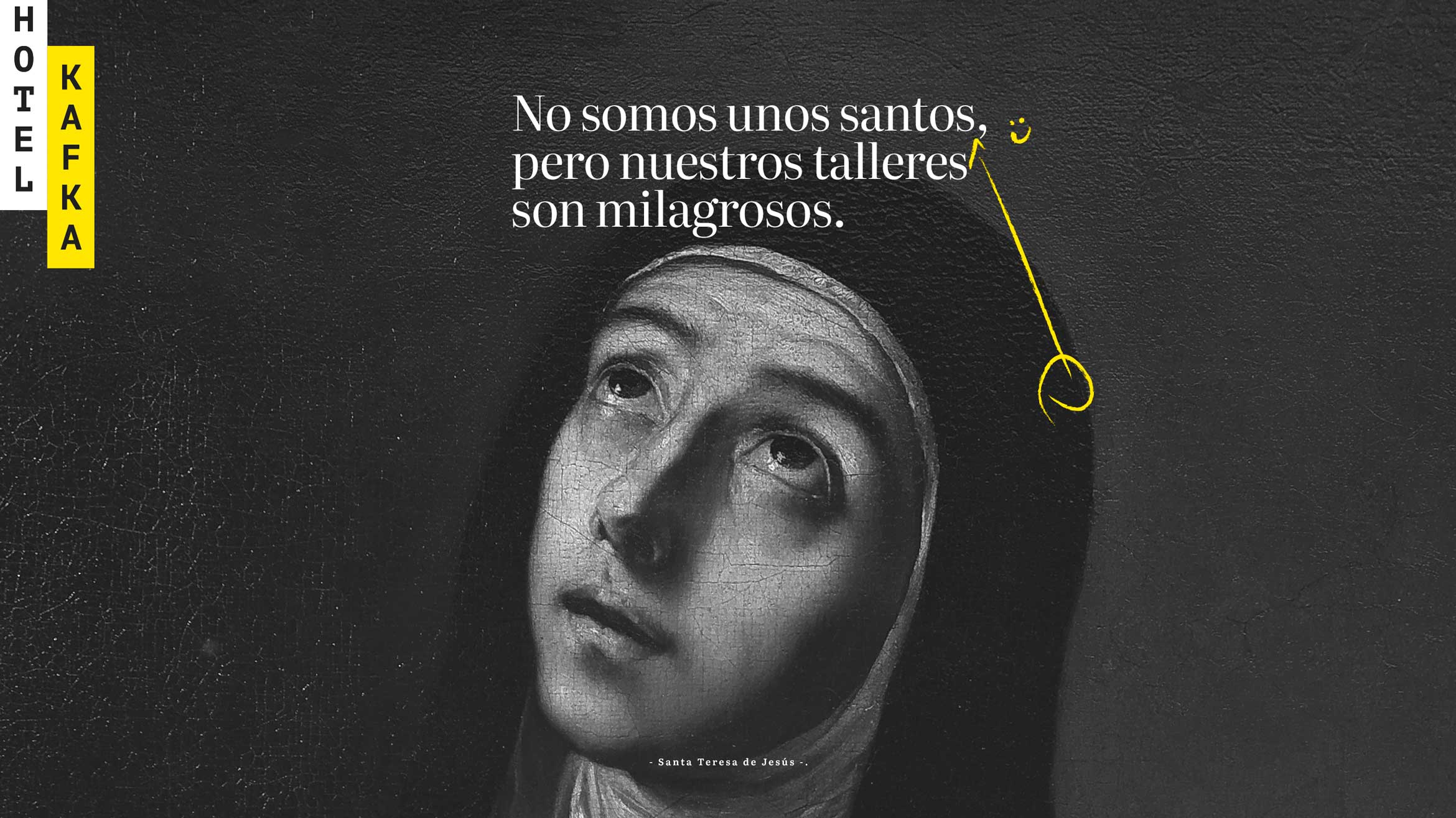
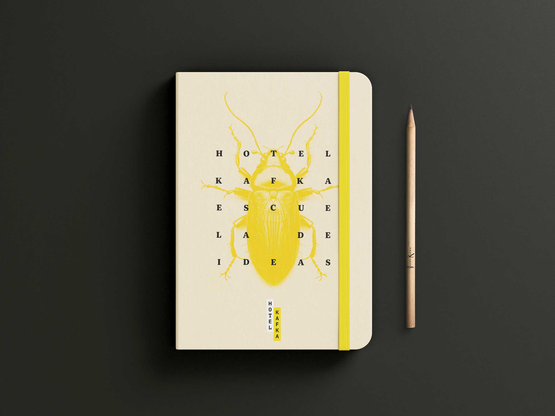
Furthermore, its visual kit has been enhanced with two things: 1. Choosing a new design of Cuca (Samsa), the arthropod that sometimes appears in some Hotel Kafka’s communications that links with the famous novella by F. Kafka (The Metamorphosis/Die Verwandlung) and 2. Designing a set of scribbles inspired by margin notes on books and proofreader's marks used on old galley proofs and use these visual elements to highlight, point or enrich some of the graphic Hotel Kafka’s communications linked to that idea of guiding, supporting and improving the writers’ texts.

Deliverables
The project deliverables have been developed in Figma. The intention here is that they can use these component-based and variant-based templates to apply auto-adjustable designs to their content without requesting a designer’s help.
And finally, Hotel Kafka always use royalty-free or Creative Commons licensed photos which can be sometimes a frustrating process. With this in mind, some props were defined with the goal of producing style-unified images in Midjourney to support some communications and to make easier this part of the process. However, concerns about the use of AIs and the way that those technologies take advantage of author’s work without compensation may lead to the decision not to use them.


