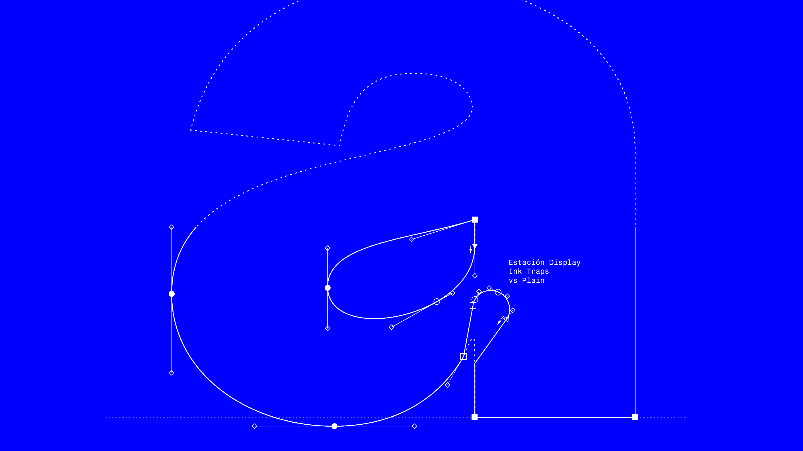
Estación Display
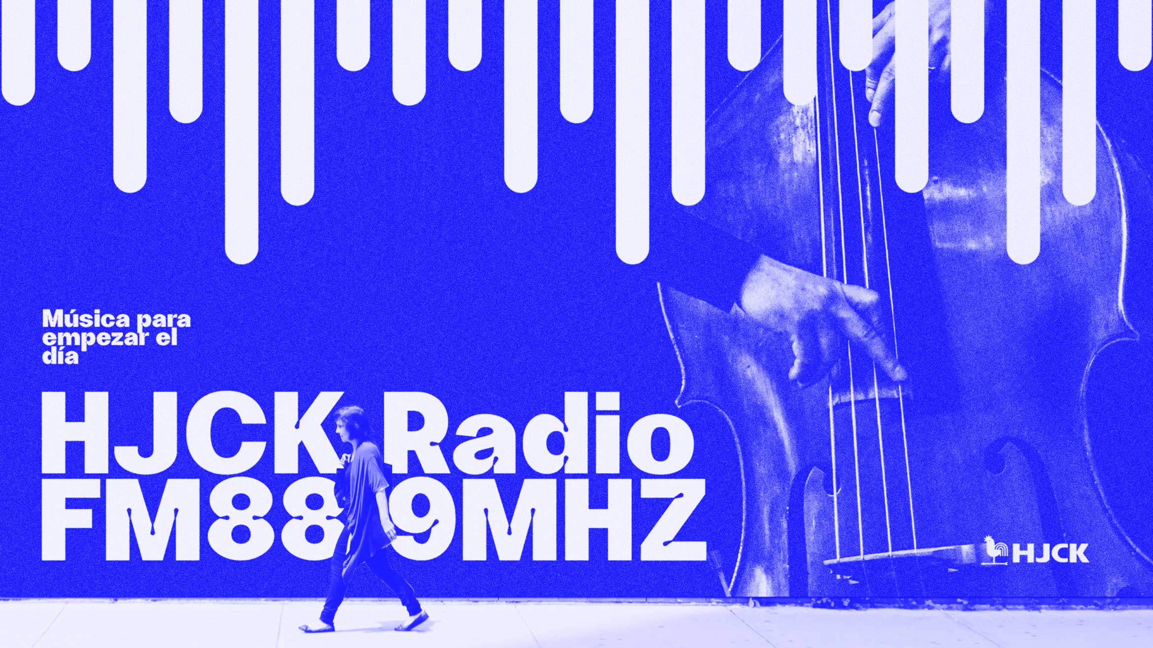
Role: typography
I like typefaces used in subway and commuter train stations. For instance, here in Madrid, Metro uses Helvetica. So, I decided to draw a new typeface based on those shapes but with a twist that made it unique. In this case, I played with ink traps (inspired by typefaces like GT Flexa, Whyte, Neue Machina, etc) to give it that particular character. Clearly, my intention here is not to create a new Helvetica or a new GT Flexa o something like that, I wouldn't know how to do it properly, I’m just in the process of learning how to draw typefaces and my goals are very modest.
In this case, I wanted to draw a different font that maybe other people can use it in their projects as I learn new things about designing fonts. I think Estación Display is suitable for packaging and some big headlines.
If you want to try it you can download it here.


Languages Supported
:
Afrikaans, Basque, Breton, Catalan, Danish, Dutch, English, Finnish, French, Gaelic (Irish, Scots), German, Icelandic, Indonesian, Irish, Italian, Norwegian, Portuguese, Sami (Southern), Spanish, Swahili, Swedish